Farmgirl Chaos Logo Reveal

REDESIGN + LOGO + BRAND COLORS


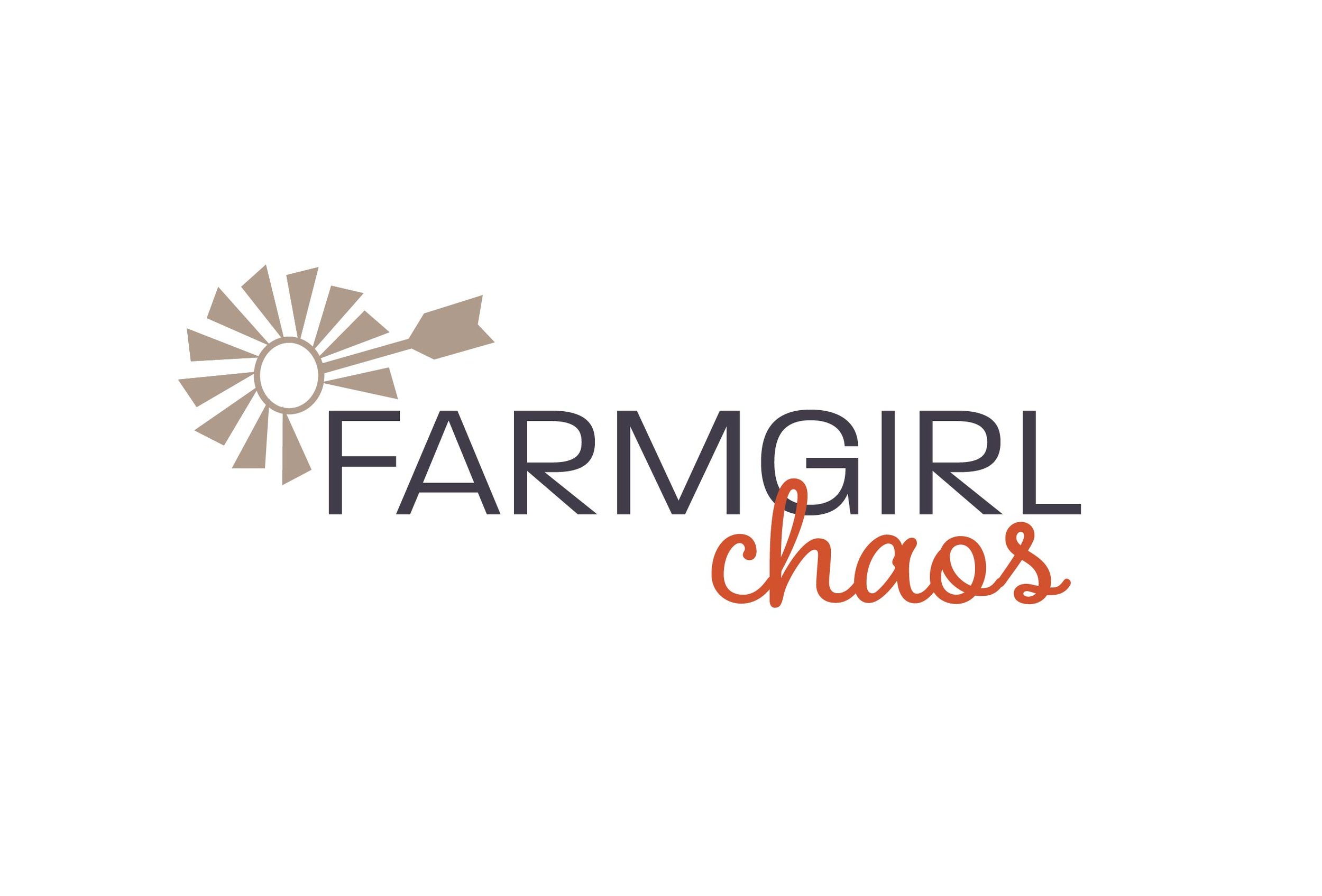
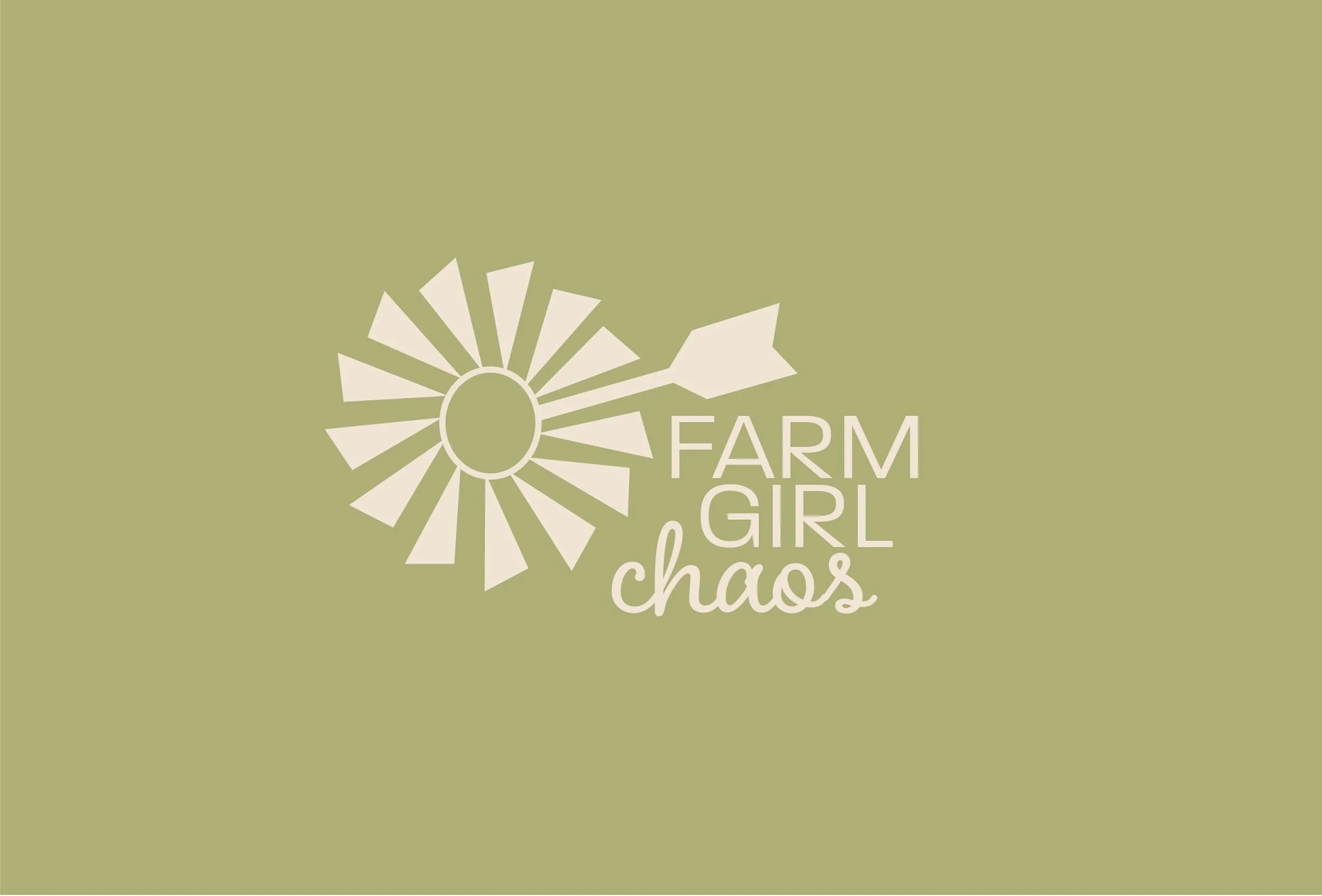
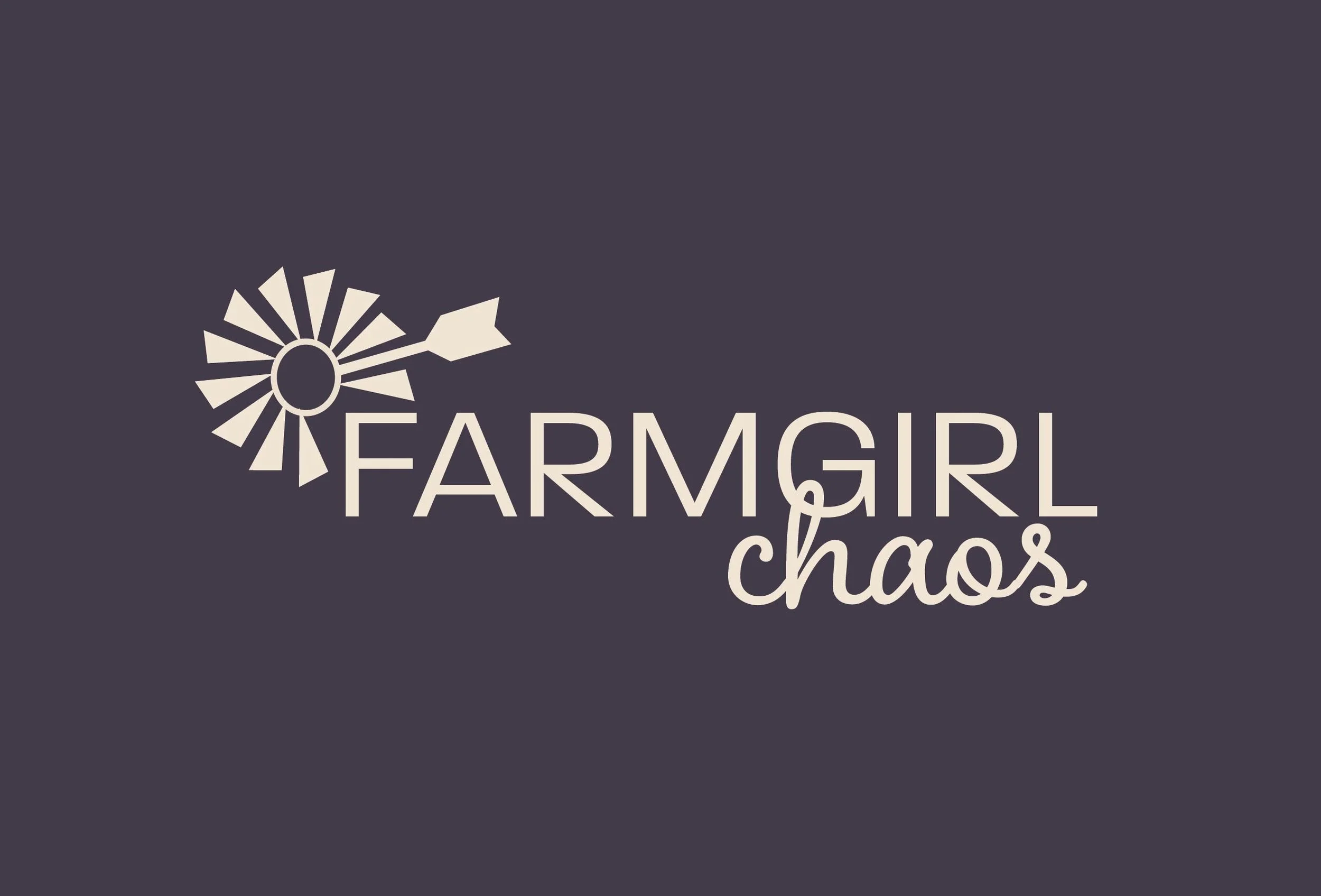
Nicole with Farmgirl Chaos came to me with a request to update her logo and solidify her brand colors. Her old logo honed an illustrated window and a very rustic font with a lasso around one of the letters. She wanted to keep a windmill in her logo but other than that, I had free rein to come up with a new brand image. I developed a cleaner, more abstract windmill and removed the foundation. Nicole loved it but wanted to add a "tail" to the windmill. After a few revisions, we came up with a windmill she loves.  


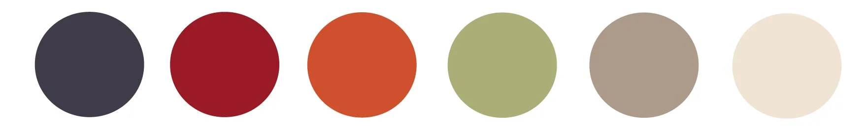
It was a lot of fun when choosing colors for Nicole's personal brand. Nicole's style is very eclectic. I have been following Nicole for a long time on social media so I had a pretty good sense of her style. I studied her Pinterest boards and her Instagram account to refresh myself and look for patterns. 

I chose Earthy but bright colors. I love how transitional the dusty plum color is. From a distance, it looks navy or charcoal. Nicole's favorite go-to color is orange so we definitely had to incorporate it into the logo. Orange is a pretty good color when representing a word like chaos. The sage green is not not featured in the main logo but it pairs perfectly with the main colors and can be used as a fun accent in marketing materials. 

Project Matters Rebrand & New Website Launch

Logo Redesign + Branding + SquareSpace Website Design + Business Card Design


I've had the pleasure of working with Amy Beechy of Project Matters on several community projects through my past work at our county Chamber of Commerce and Economic Development office.

It was exciting to finally work on a very special one: her own. In the service and consultant industry, we often get caught up with putting our clients first and it's easy to put our own marketing on the back burner!

Amy came to me with the need to update her website. Her old website, although tidy was not 'clean' due to the table lines and lacked personality. Her current brand was not as recognizable as it should be. Moving forward, as I begun casting a vision for the new Project Matter's website, I really wanted Amy to look at changing up her brand. Previously, her logo honed a terrific font and layout but it lacked the right coloring to properly reflect her brand and image.

Branding

Colors

In order to find the correct color palette for the new Project Matters brand, I had Amy find pictures of things she was attracted to. They could be anything and everything. I put them all together on a mood board.


As you can see, I saw a very similar pattern form. Amy is very attracted to burnt orange, mustard, cool shades of gray and black which is what I pulled out for her new branding. She likes clean lines and rustic textures. 


Logo

Amy's original colors were lime green and navy blue. For the new Project Matters logo, I kept the same font from the original design because it was perfect but I swapped out the navy and lime green for the new brand colors, resulting in a much better fit for the new brand.

Stock Images

For the brand's image, I looked for stock photos featuring soft tones of burnt orange, mustard and grays with rustic, industrial textures. 

AdobeStock_89611334.jpeg

These stock images really set the tone for the Project Matters brand and website. 

Professional Headshot

Headshots and lifestyle portraits are an important piece to the branding puzzle. I wanted to make sure Amy's updated portrait was professional but branded with the right colors and texture. If done right, your headshot can help set the tone for your brand. I met Amy at Debruler Images in Rochester, Indiana where we worked with photographer Dave Fincher on the right image. Dave nailed it and captured my vision perfectly. 


Photo credit: Debruler Images, ROchester, IN


Website

For the Project Matters website, I wanted to keep the homepage clean and simple. Amy does contract and consultation work especially for non-profit organizations. I wanted to create a design that allowed potential clients to keep digging further to learn more about Amy's work but display her professionalism, organization and creativity up front. 

Since Amy is attracted to rustic, industrial textures, I thought the brick pattern behind an opaque white background would set a nice clean stage but still allow for personality to shine through. 


Each page contains an action item at the end that leads potential clients into the next step. Once we've learned about Amy's background, we then visit her area of expertise then onto past projects she's completed, clients she has worked with followed with client testimonials. We end the website visit with a Contact page that features the mustard colored chair. After discovering the services of Project Matters, one should feel relaxed and ready to reach out and hire Amy.

I love the mustard yellow featured in the header front. It provides a soothing atmosphere but paired with the capital letters, it shows that Amy is serious about putting 100 percent into each project she takes on.


Visit the new Project Matters website!

Business Cards

Business cards and referalls are a very important marketing tool for Amy. I wanted to make sure that the atmosphere of her new brand was represented during that first impression. 

The new business cards for Project Matters hone style and professionalism. Right away you find Amy's area's of expertise and services listed. We feature Amy's important contact information. I love how the card is branded but doesn't look cluttered. 


Client Testimonial

I've enjoyed working with all of my clients but Amy truly stands out as one of my favorites. Her organization, passion and attention to detail when it come to her business is like none I've encountered. We make a great team! 

On the flip side, I asked Amy about her experience working with OBS creative services.

"I was long overdue for an updated web site but dragging my feet to go through the process because I know it can be tedious.  Not only did I need a website update but some tweeks made to my branding.  I had worked with Kelly Whiteman Snipes in other capacities and recognized her talent and professionalism so when she started her own business, I was very comfortable working with her on my website.  The experience was outstanding.  Kelly has graphic design skills that are some of the best I’ve ever seen.  She created a site that truly reflects my brand and my business.  The process was organized, timelines were met, and I’m really happy with my new site, new logo, and new business cards.  I highly recommend Kelly and I refer her services to fellow business owners on a regular basis! "    

- Amy Beechy, Project Matters